Color Psychology in Dating Photos: How Colors Affect Tinder Matches
Color Psychology in Dating Photos: How Colors Affect Tinder Matches
Colors are not neutral. In less than a second, your brain processes the chromatic information of an image and forms unconscious impressions that directly influence attraction. On dating apps like Tinder, Bumble, and Hinge, where every detail counts, mastering color psychology can make the difference between a left swipe and a match.
Understanding how colors affect perception can help you choose the right outfits, backgrounds, and accessories for your dating app photos—potentially increasing your match rate by up to 47%.
The Science Behind Color Impact
🧠 How Our Brain Processes Colors
Colors are processed 60,000 times faster than text by our brain. Before even consciously noticing your smile or style, the observer has already formed a first impression based on the chromatic palette of your photo.
📊 Revealing Statistics
- 85% of purchase decisions are influenced by colors
- Colors increase memorization by 82%
- On dating apps, certain colors increase matches by up to 47%
🎨 Psychological Mechanisms
Colors activate three levels of reaction:
- Physiological: Automatic bodily reactions
- Psychological: Emotions and mental associations
- Cultural: Socially learned meanings
Red: The Color of Passion and Power
🔴 Psychological Impact of Red
Red is the most powerful color in terms of attraction. It stimulates:
- Physiological excitement: Increased heart rate
- Immediate attention: Impossible to ignore
- Association with passion: Love, desire, energy
📈 Effectiveness Statistics
- Women in red: +56% male matches
- Men in red: +23% female matches
- Red accessories: +31% engagement
✅ How to Use Red Effectively
For women:
- Red dress for an elegant photo
- Red lipstick to draw attention to the smile
- Red accessories: Bag, shoes, jewelry
For men:
- Red shirt (be careful not to appear aggressive)
- Red accessories: Tie, watch, cap
- Red background: Wall, car, decor
⚠️ Precautions with Red
- Avoid total red: Can appear aggressive
- Dose subtly: One red element is enough
- Watch the context: Inappropriate for certain situations
Blue: The Color of Trust and Stability
💙 Psychology of Blue
Blue evokes:
- Trust and reliability: Favorite color of 40% of the population
- Calm and serenity: Scientifically proven calming effect
- Professionalism: Associated with success and competence
📊 Impact on Dating
- Navy blue: +34% perceived reliability
- Sky blue: +28% perceived approachability
- Profiles with blue: 23% longer conversations
✅ Optimal Use of Blue
Navy blue:
- Suits and shirts: Professional elegance
- Dresses: Sophistication without ostentation
- Backgrounds: Sky, sea, urban settings
Light blue:
- Casual outfits: Jeans, t-shirts, summer dresses
- Accessories: Scarves, jewelry, bags
- Natural contexts: Photos near water
💡 Psychological Tip
Blue is particularly effective for reassuring and giving an impression of emotional stability, crucial for serious relationships.
Green: Harmony and Nature
💚 Symbolism of Green
Green communicates:
- Balance and harmony: Most restful color for the eye
- Nature and authenticity: Connection to environment
- Growth and vitality: Positive energy and health
🌿 Impact on Attraction
- Green in nature: +41% perceived attractiveness
- Green clothing: +19% approachability
- Green eyes highlighted: +67% attention
✅ Strategies with Green
Emerald green:
- Elegant outfits: Dresses, shirts, accessories
- Eye highlighting: Especially for green/hazel eyes
Natural green:
- Outdoor photos: Parks, forests, gardens
- Casual outfits: Sweaters, t-shirts, jackets
- Nature sports: Hiking, cycling, gardening
🌱 Environmental Psychology
Green suggests a balanced personality and ecological awareness, highly valued currently.
Black: Elegance and Mystery
🖤 Power of Black
Black evokes:
- Sophistication: Timeless elegance
- Mystery and depth: Intrigue and complexity
- Power and authority: Self-confidence
📸 Photographic Effectiveness
- Maximum contrast: Highlights complexion
- Slimming: Universally flattering effect
- Timeless: Never goes out of style
✅ Mastering Black
Total black:
- Evening wear: Guaranteed elegance
- Artistic portraits: Dramatic effect
- Accessories: Glasses, jewelry, bags
Black and white:
- Artistic photos: Timelessness
- Classic portraits: Focus on expression
- Minimalist style: Modern sophistication
⚠️ Watch for Excess
- Avoid "all black": Can appear dark
- Balance with colors: Touches of bright color
- Appropriate context: Not for all situations
Pink: Softness and Femininity
🌸 Psychology of Pink
Pink communicates:
- Softness and kindness: Soothing effect
- Femininity: Traditionally associated
- Youth and freshness: Vitality and optimism
👗 Gender Impact
For women:
- Powder pink: +29% perceived softness
- Bright pink: +22% perceived energy
- Pink accessories: +15% femininity
For men:
- Salmon pink: Modernity and confidence
- Pink accessories: Assumed originality
- Appropriate context: Casual, creative
✅ Subtle Use of Pink
- Sunsets: Natural pink lighting
- Flowers: Floral backgrounds
- Makeup: Natural pink tones
- Clothing: Delicate touches
Yellow: Optimism and Energy
☀️ Power of Yellow
Yellow evokes:
- Joy and optimism: Color of happiness
- Energy and vitality: Mental stimulation
- Creativity: Innovation and originality
🌟 Social Effectiveness
- Yellow in photos: +33% perceived optimism
- Yellow accessories: +27% perceived energy
- Smiles highlighted by yellow ambient
✅ Smart Yellow Integration
Soft yellow:
- Golden lighting: Golden hour, sunsets
- Accessories: Gold jewelry, bags, shoes
- Backgrounds: Sunflower fields, beaches
Bright yellow:
- Accent touches: T-shirts, summer dresses
- Festive contexts: Festivals, events
- Sports: Cycling, running, outdoor activities
⚠️ Moderation Necessary
Yellow can be overwhelming in large quantities. Use it in subtle touches.
Purple: Creativity and Spirituality
💜 Symbolism of Purple
Purple represents:
- Creativity and artistic: Originality
- Spirituality: Intellectual depth
- Luxury and refinement: Sophistication
🎨 Impact on Perception
- Purple in photos: +25% perceived creativity
- Purple accessories: +31% originality
- Particularly effective for artistic profiles
✅ Creative Use of Purple
- Sunsets: Natural purple skies
- Flowers: Lavender, lilacs, violets
- Accessories: Scarves, jewelry, makeup
- Art and culture: Galleries, theaters, concerts
Orange: Warmth and Sociability
🧡 Energy of Orange
Orange communicates:
- Human warmth: Conviviality
- Sociability: Openness to others
- Enthusiasm: Positive energy
🔥 Social Effectiveness
- Orange in photos: +38% perceived sociability
- Particularly effective for group photos
- Sunsets: Natural orange lighting
✅ Subtle Orange Integration
- Natural lighting: Golden hour, campfires
- Accessories: Bags, shoes, jewelry
- Social contexts: Restaurants, cafés, events
Winning Color Combinations
🎨 Harmonious Palettes
Classic combinations:
- Blue + White: Freshness and purity
- Red + Black: Passion and elegance
- Green + Beige: Nature and authenticity
- Pink + Gray: Softness and sophistication
🌈 Chromatic Composition Rules
- Maximum 3 dominant colors per photo
- One main color + accents
- Avoid colors that fight each other
- Harmonize with your complexion
Colors According to Your Complexion
🌟 Warm Complexions (golden undertones)
Colors that enhance you:
- Orange-reds: Coral, vermillon
- Warm greens: Olive, khaki, emerald
- Yellows: Mustard, gold, champagne
- Browns: Camel, chocolate, bronze
❄️ Cool Complexions (pink/blue undertones)
Colors that flatter you:
- Cool reds: Cherry, burgundy, raspberry
- Blues: Navy, royal, turquoise
- Pinks: Fuchsia, powder pink, magenta
- Purples: Lavender, plum, amethyst
🎯 Simple Test to Determine Your Complexion
Look at your wrist veins:
- Green: Warm complexion
- Blue/purple: Cool complexion
- Mix: Neutral complexion (lucky, everything suits you!)
Colors According to Your Goals
💕 For a Serious Relationship
Favor:
- Blue: Trust and stability
- Green: Balance and authenticity
- White: Purity and honesty
- Beige/Nude: Natural and sincerity
🔥 For More Casual Dating
Choose:
- Red: Passion and attraction
- Black: Mystery and seduction
- Orange: Energy and fun
- Purple: Originality and creativity
🎯 To Maximize Matches
Winning combination:
- Photo 1: Red (immediate attraction)
- Photo 2: Blue (trust)
- Photo 3: Green (authenticity)
- Photo 4: Natural colors (daily life)
Chromatic Mistakes to Avoid
🚫 Colors That Repel
- Dull brown: Can appear bland
- Too dominant gray: Impression of sadness
- Aggressive neon: Aggresses the eye
- Dirty colors: Lack of care
⚠️ Common Pitfalls
- Too many colors: Visual chaos
- Fighting colors: Bright red + bright green
- Unsuitable colors for complexion
- Dated colors: Past trends
Optimization by Season
🌸 Spring
Trending colors:
- Pastels: Pink, soft green, sky blue
- Fresh colors: White, beige, nude
- Bright touches: Yellow, coral
☀️ Summer
Summer palette:
- Bright colors: Red, orange, turquoise
- Bright whites: Purity and freshness
- Navy blues: Nautical elegance
🍂 Fall
Warm tones:
- Oranges: Rust, terracotta
- Rouges profonds: Burgundy, garnet
- Bruns: Camel, chocolate, cognac
❄️ Winter
Sophisticated colors:
- Elegant blacks: Sophistication
- Rouges profonds: Winter passion
- Bleus nuit: Mystery and depth
Advanced Highlighting Techniques
🎨 The 60-30-10 Rule
- 60%: Dominant color (main clothing)
- 30%: Secondary color (accessories, background)
- 10%: Accent color (details, jewelry)
🌈 Contrast and Harmony
Effective contrasts:
- Complementary colors: Red/green, blue/orange
- Value contrasts: Light/dark
- Temperature contrasts: Warm/cool
💡 Lighting and Colors
- Warm light: Enhances reds, oranges, yellows
- Cool light: Highlights blues, greens, purples
- Natural light: Reveals true colors
Color Psychology by Gender
👨 Male Preferences (what attracts men)
- Red: +56% attraction
- Pink: +34% perceived softness
- Blue: +28% trust
- White: +25% purity
- Black: +22% sophistication
👩 Female Preferences (what attracts women)
- Blue: +41% reliability
- Green: +35% authenticity
- Red: +29% passion
- Black: +26% elegance
- White: +23% sincerity
Colors and Personality
🎭 What Your Colors Say About You
Red: Passionate, energetic, leader Blue: Reliable, calm, professional Green: Balanced, natural, authentic Black: Sophisticated, mysterious, elegant White: Pure, simple, honest Yellow: Optimistic, creative, energetic Purple: Artistic, spiritual, original Orange: Sociable, warm, enthusiastic
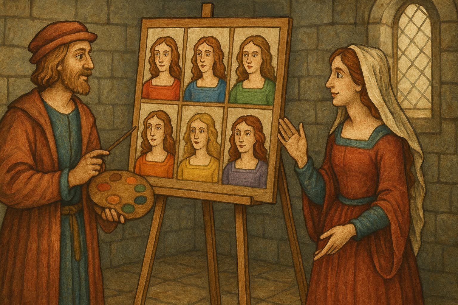
How to Analyze Your Photo Colors
Understanding which colors work best for your profile requires objective analysis. Get AI analysis of your dating app photos to evaluate:
- Color composition and balance
- Which colors enhance your appearance
- Chromatic impact on attractiveness
- Recommendations for optimal color choices
- Comparison to high-performing profiles
Chromatic Action Plan
📅 Audit of Your Current Profile
- Analyze your dominant colors in each photo
- Identify inconsistencies across your profile
- Spot colors that don't flatter your complexion
- Note reactions to your current photos
🎨 Personalized Color Strategy
- Determine your complexion (warm/cool)
- Choose 3-4 main colors that work for you
- Plan your outfits by photo
- Coordinate with backgrounds
📸 Optimized Photo Session
- Prepare several outfits in your optimal colors
- Choose locations with harmonious colors
- Vary color combinations across photos
- Test different lighting conditions
FAQ: Color Psychology in Dating Photos
Do colors really affect my match rate?
Yes. Studies show certain colors can increase matches by up to 47%. Red increases matches by 23-56% depending on gender, while blue increases perceived trust by 34%.
What's the best color for my main photo?
For women: Red (dress, lipstick, or accessories) increases matches by 56%.
For men: Blue (shirt or background) increases perceived reliability by 34%.
For both: Authentic colors that flatter your complexion work best.
Should all my photos have the same color scheme?
No. Vary colors across photos to show different aspects of your personality. Use a cohesive palette but not identical colors.
How do I know if a color flatters me?
Determine if you have a warm or cool complexion:
- Warm: Golden undertones, green veins → Reds, oranges, warm greens
- Cool: Pink/blue undertones, blue veins → Blues, purples, cool pinks
- Neutral: Mix of both → Most colors work
Can I use black and white photos?
Yes, but sparingly. One black and white photo can be artistic and sophisticated, but your main photo should be in color for maximum impact.
Do background colors matter?
Yes. Background colors should complement your outfit and not distract from you. Natural backgrounds (sky, nature) or neutral colors work best.
Should I avoid certain colors?
Avoid:
- Dull browns (can appear bland)
- Too much gray (can seem sad)
- Aggressive neon colors (overwhelming)
- Colors that clash with your complexion
How many colors should be in one photo?
Follow the 60-30-10 rule:
- 60% dominant color (main clothing)
- 30% secondary color (accessories, background)
- 10% accent color (details, jewelry)
Conclusion: Your Personal Palette
Colors are a universal language that speaks directly to the unconscious. Mastering their psychology gives you a considerable advantage on dating apps, where every detail counts.
Your next steps:
- Identify your most flattering colors based on your complexion
- Create a coherent palette for your profile
- Test the impact of different combinations
- Adjust according to your relationship goals
Remember: authenticity remains paramount. Colors should enhance you, not transform you. Use this knowledge to reveal the best version of yourself.
Want to know exactly which colors work best for your photos? Get AI analysis of your profile to see how your current colors affect your match rate and get personalized recommendations.
Ready to optimize your photo colors? Analyze your dating app photos to see how colors impact your profile and get specific recommendations to maximize your attractiveness.
Ready to optimize your profile?
Use Pic Boost to get a detailed analysis of your photos and personalized recommendations.